Our Logo
Every company needs a logo that represents them. That represents the value of the brand and the values of the company. The logo is practically the face of the company.
For these reasons, our company Emergency Energy decided to use a logo with two capital letters that represent the first two letters of the company name.
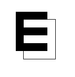
The colors that we chose were black and white. The black color symbolizes the darkness and the white light. The contrast of both colors represent the darkness of the electronic devices screens when running out of battery and the light represents the screens on when they have a battery. Our logo also resembles the Yin Yang, which symbolizes the contrast between light and darkness according to Chinese philosophy.
One of the vowels is reversed symbolizing that our company want to turn the daily problems with the batteries of electronic devices to make the lives of people easier.
One of our intentions with our logo is to be identified with the name of the brand and with the usefulness of our product so that everyone knows the great utility of our product.
Carlos Fernández García
Comentarios
Publicar un comentario